Choosing the colors for your home is regarded by many as a nerve-wracking experience. Let me share with you a few basic principles that will help you choose well. Then we’ll move on to a fun exercise that will unlock the secret to YOUR color sense and give you the keys to building up your color palette over time via layers.
How Color Works – The Basics
There are two basic color distinctions which impact the interior design of a space:
1. Warmth versus Coolness
2. Lightness versus Darkness
Let’s look at wall colors and what they do to a room.
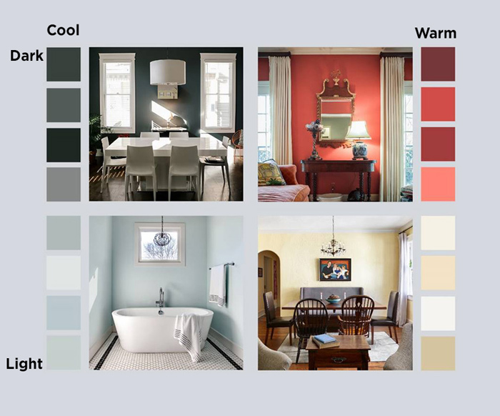
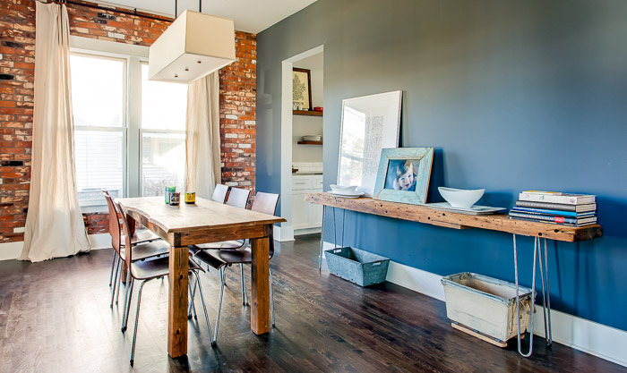
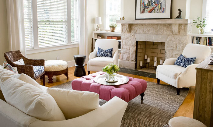
Warm VS Cool
Warm colors include: Red, orange, yellow, taupe, cream, brown.
Warm colors physically feel warmer, and emotionally feel cozy and inviting.
Cool colors include: Purple, blue, green, grey, black, white.
Cool colors physically feel colder, and emotionally feel cerebral or meditative and fresh.
Dark VS Light
Light colors make a room seem bigger, lighter and brighter. A light wall color can serve as a soft backdrop for other dramatic elements in the room.
Dark colors, by contrast, pull the room in, add drama and emotion. When a dark wall color is mixed with other dark elements, such as furniture and drapes, it creates a richness and depth.
Exercise Time
Let’s have a little fun and do a Magazine Exercise (Pinterest works too!) Gather up all your Home decor magazines and start pulling out all the images that have colors that appeal to you. When you have a nice pile spread them out and look for the color theme that emerges.
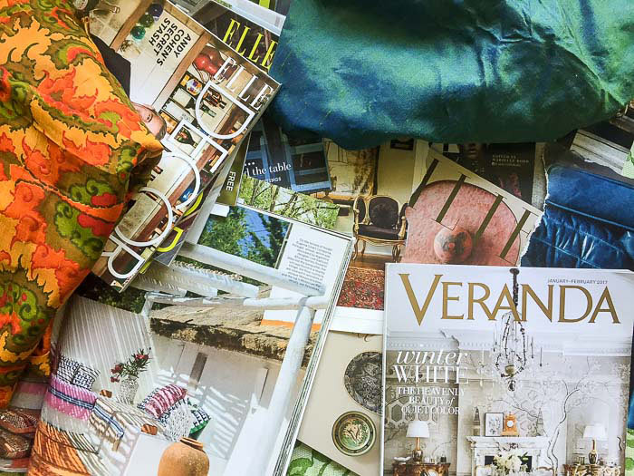
Warm versus cool:
Are the walls in the rooms overall a cool color (blues, greens, purples) or a warm color (reds, oranges, yellows)? Stark whites read cool; warm, buttery whites read warm. Are the things within the room warm or cool, or is there a mix of the two? Woods tend to feel warm; metals tend to feel cool.reates a richness and depth.
Dark versus light:
Are the walls dark and the things within the room light? Or are the walls and all the things within dark and rich? Or is it the other way around, and the walls and the room’s contents are light? Or are the walls light, but there are some accents and focal points that are rich and dark?
Feeling Crafty?
Cut your choices up and paste them on a poster board or into a journal. Write your findings down – this is your color palette.

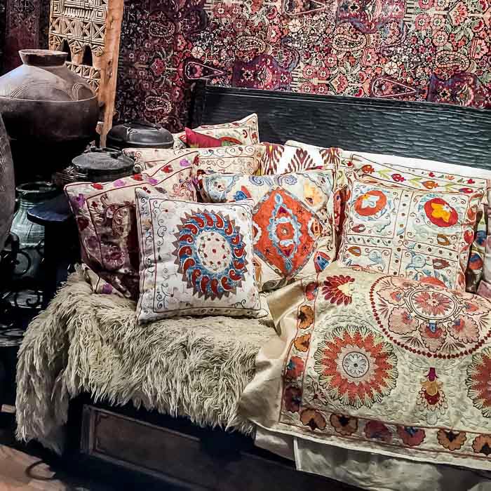
PRO TIP
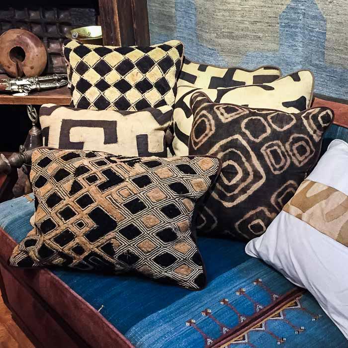
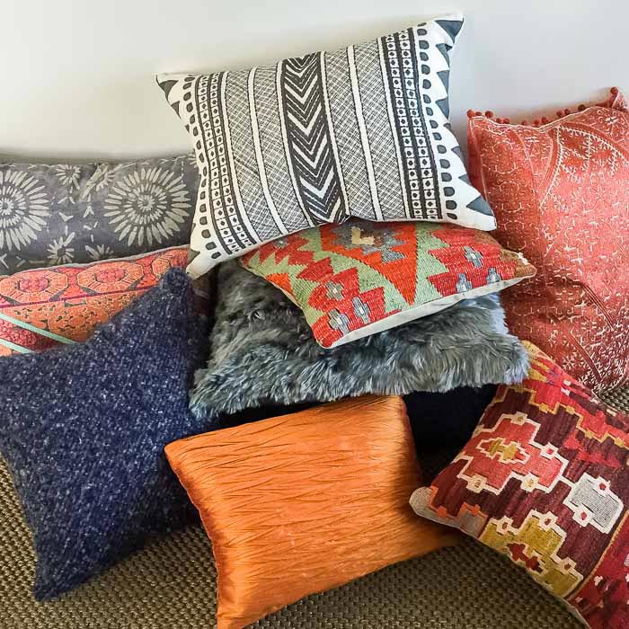
Pillows are the perfect segue into colors, textures, and patterns. These elements make up your own personal aesthetic – your sense of “what makes you feel alive.” There is no right or wrong way to go with pillows; you can have lots of color and pattern, or very little. You can mix it up eclectically, or keep it spare and simple.
The challenge is to become comfortable with what speaks to you. Pillows are relatively cheap and easy to buy, easy to mix up, experiment with and change out over time. What a fun way to explore your color palette!
Thanks for sharing. I read many of your blog posts, cool, your blog is very good. https://accounts.binance.info/kz/register?ref=K8NFKJBQ
Thank you for your sharing. I am worried that I lack creative ideas. It is your article that makes me full of hope. Thank you. But, I have a question, can you help me?
Your article helped me a lot, is there any more related content? Thanks!
Your point of view caught my eye and was very interesting. Thanks. I have a question for you.
References:
Casino miami jai alai https://gamingwiki.space/wiki/Farm_to_Table_Bistro_Fishkill_Menu_Reviews_224_Photos_67
Your article helped me a lot, is there any more related content? Thanks!