A Blue Year…
So the 2020 color of the year is Classic Blue. This brings about the inevitable questions: I love this color. And I really love this wallpaper in that color. I’m seeing it everywhere, and it’s really growing on me. But will it date itself over time? My question to them is: Do you love that color?
Me personally, I love blue. It happens to be one of my favorite colors. Even before Classic Blue was the color of the year, David and I fell in love with our Blue Wall (as we call it) in our dining room. So much so that when we added a kid and renovated, we painted our dining room wall that exact same blue!
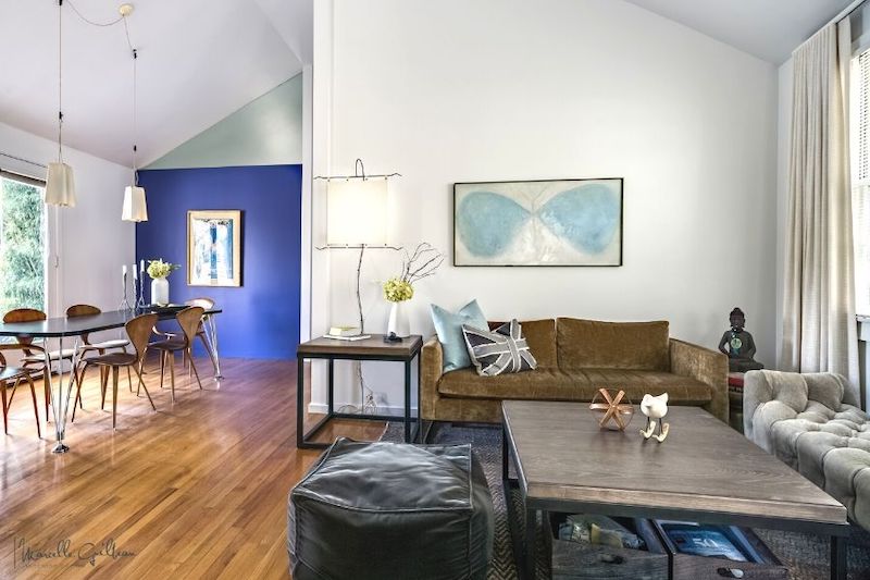
My other favorite color is yellow. Or gold. Or warm cream. Those are all shades of yellow to me. So you can see that I have the blue dining room wall, with a gold-framed artwork on it, and a gold sofa in the living room. Cream parchment lampshades and linen drapes. I am home. These colors also happen to reflect my happy place: The beach. And when we complete the house addition, I will paint the other feature wall in the house – the mudroom – yellow.
The Perennial Question…
The question, “I love this color – but will it date itself over time?” is a perennial question I hear my clients ask me. So let’s talk about what will date itself: Colors that you grow tired of. Bright, loud colors may indeed tire most people. However, some people love them. So the question still goes back to you. What do you love?
If you need help dialing into your color tastes, here is a previous post with an exercise in it, which I have created to help you sort it out. Link Here.
But still, the question nags, what do I do with my favorite colors? It so happens that I have been working on the answer to that question in my upcoming book, The Soulful Home. And here is the skinny: You must create your color palette.
The 1-2-3 Process…
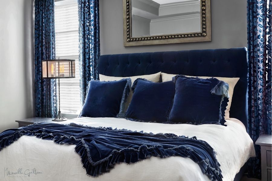
The first step in any design is to built out your timeless and classic base with the furniture selections. From there we move onto your color palette. Whether you’ve decided to go with a blue palette, or any other palette, you want to do it right. In a room, a color palette is three dimensional; it is not a painting; it is not a room shot, my dear fellow Pinterest addicts. It is above, below, and around you. So how do you create that? What I and my team do is to build it, three-dimensionally. I call it the “1-2-3”. When you are putting a living room together, it’s the sofa, the throw pillows, and the rug.
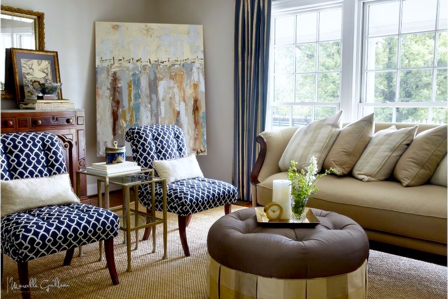
Playing with the fabrics which you have chosen for your sofa and pillows, or any room, will give you a world of information about the colors that you love. Allow yourself to fall in love with a color or two. Then, decide what you want to do with it. Work your way out into your three dimensional space, from the sofa, to the throw pillows, to the rug.
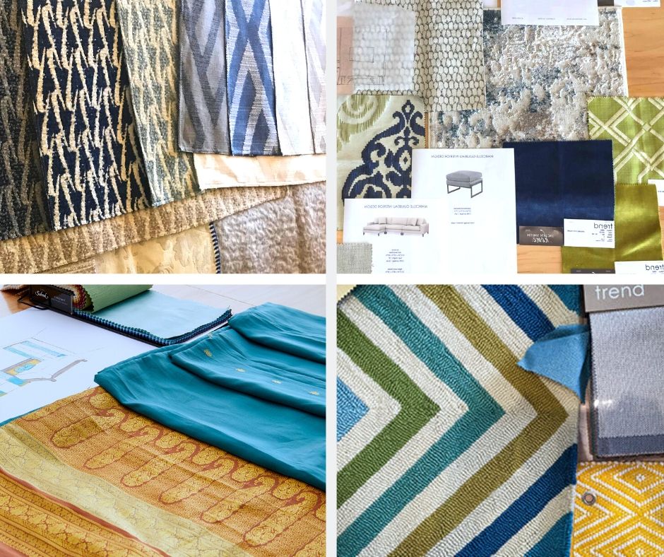
Once you have settled on that color palette, then you can expand out: To the next 1-2-3: The walls, the window treatment, the artwork. If you limit yourself to selecting three things at a time, it helps you to not get overwhelmed.
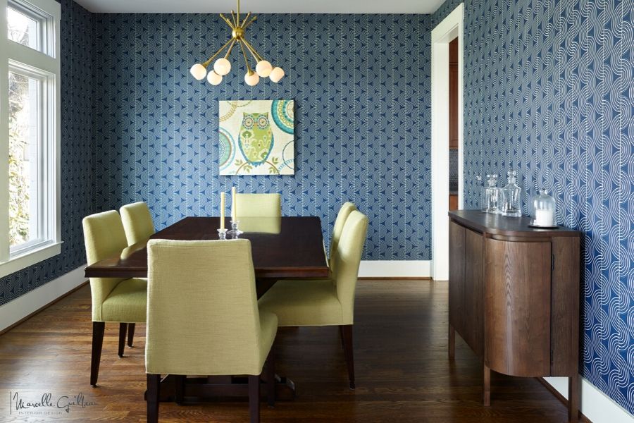
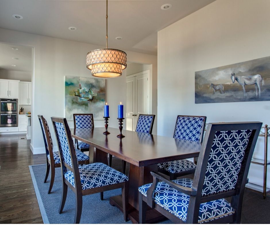
If it’s the dining room, this might be: The table, the chairs, and the walls.
A powder room is an easy target: The floor may already be hardwood; the plumbing fixtures are typically white. This is a good place to throw in a wallpaper, and have very little issue with how it comes out.
When selecting your wallpaper, there are a few things I invite you to keep in mind and I’ve written all about it in, The Wallpaper Design Layer
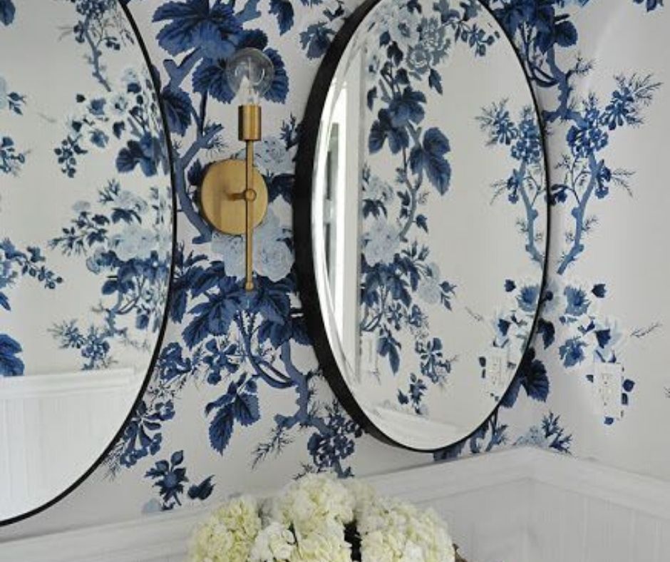
Image – Pinterst – Bold Color, Wallpaper – Decortors Best, Schumacher Pyne Hollyhock Indigo Wallpaper Design by Dear Lillie
The Feeling of Blue…
Color is one of the most impactful was to create ambiance in a room. It is part of a homes’ aesthetic. And as I’ve mentioned many times before, aesthetic is what makes us feel alive, and what we feel most comfortable in. Aesthetic does involve more than just color, but today we’re talking about blue.
So, when considering how your home feels, and how color affects its, we need to consider both warm vs cool, and light vs dark.
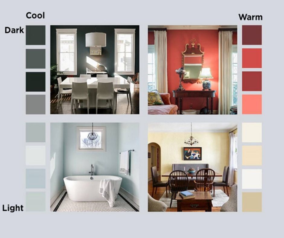
Blue is considered a cool color, bringing a fresh, contemplative feel to a space. It is calm and soothing. And when it comes to light vs dark you’ll want to consider that light colors make a room seem bigger and brighter. A light wall color can serve as a soft backdrop for other dramatic elements in the room. Dark colors, by contrast, pull the room in, add drama and emotion. When a dark wall color is mixed with other dark elements, such as furniture and drapes, it creates a richness and depth.
Finally… Recently I came across this really well article on the’Psychology of Blue.’ If you want to dive a little deaper, I recommend it as a great source.
Enjoy!

– Marcelle Guilbeau
Your point of view caught my eye and was very interesting. Thanks. I have a question for you.
Thanks for sharing. I read many of your blog posts, cool, your blog is very good.
Thank you for your sharing. I am worried that I lack creative ideas. It is your article that makes me full of hope. Thank you. But, I have a question, can you help me?
I don’t think the title of your article matches the content lol. Just kidding, mainly because I had some doubts after reading the article. https://www.binance.com/register?ref=QCGZMHR6
Can you be more specific about the content of your article? After reading it, I still have some doubts. Hope you can help me. https://www.binance.bh/register?ref=JW3W4Y3A