
If you’ve been following this blog since the beginning of the year, you’ve uncovered your Soul Style and know how your lifestyle and aesthetic weave through it. You’ve learned that your design Building Blocks need to support your lifestyle. Perhaps you’ve also ascertained what the room wants, what you want, and are now poised to buy that sofa or sectional. Yes, we’ve covered ground!
If you’re one of my clients, you’ve been anxiously awaiting to move on to the fun part — design layering. This stage is by far the most creatively satisfying part of designing your home. It’s when you get to select your throw pillows, your rugs, the art and your window treatments. Together, all these pieces create your unique soul style… Your look!
The Layering Process…
The Layering process is when the “aesthetic” of a design project can finally unfold. It’s when you can truly create your unique soul style, and ultimately a Soulful Home.
The key to not getting overwhelmed is to think of it exactly as it’s called, a layering “process.” So what exactly is a “layer?” Layers are the components I just mentioned above, the rugs, toss pillows, the art, etc. They are layered onto your building blocks, but unlike your building blocks, there is no necessary order to the selection and implementation of layering.
I’ve often found that my clients and I go into a fabulously bold and creative direction when we pace the process and wait for a ‘response’ to tell us how a room feels. This is a time to absorb and allow inspiration to guide the way. It’s not such terrible thing to live without a rug for a few months after the sofas have come in. Believe me, you’ll be happy you did.
There is only one conversation that’s needed to get started with your layering process and that’s the color palette. And that’s what most of this blog will cover; a few basic principles along with a few strategies to help you choose well. After that, we’ll look at the layers, what they do, and how they contribute to the four Soul Styles.
Color…
There are two basic color distinctions which impact the interior design of a space: Warmth versus coolness, and lightness versus darkness. To illustrate this, let’s look at wall colors and what they do to a room.
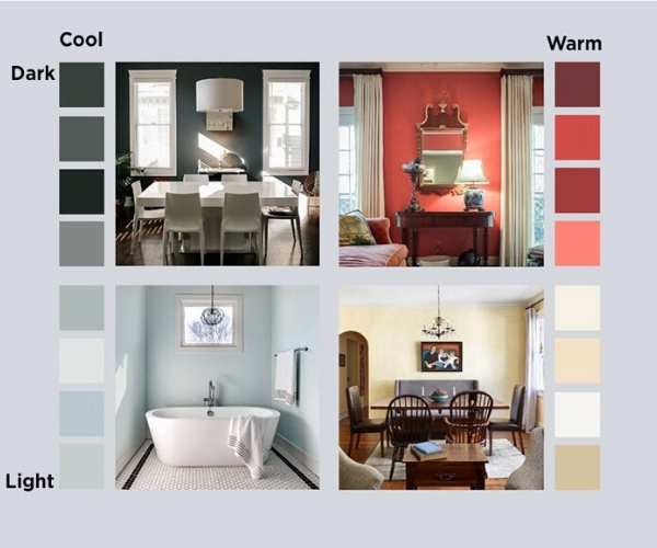
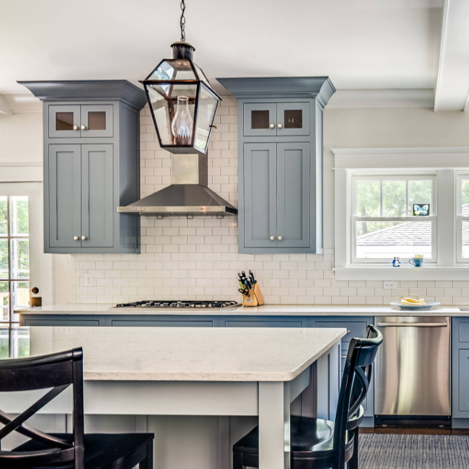
Warm colors include – Red, orange, yellow, taupe, cream, brown. Warm colors physically feel warmer, and emotionally feel cozy and inviting.
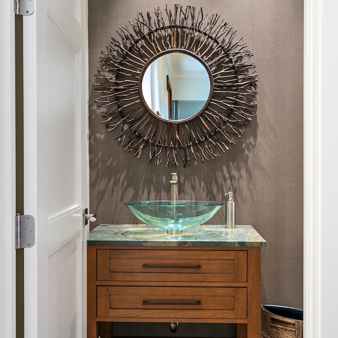
Cool colors include – Purple, blue, green, grey, black, white. Cool colors physically feel colder, and emotionally feel cerebral or meditative and fresh.
Color Distinction…
Coolness vs Warmth
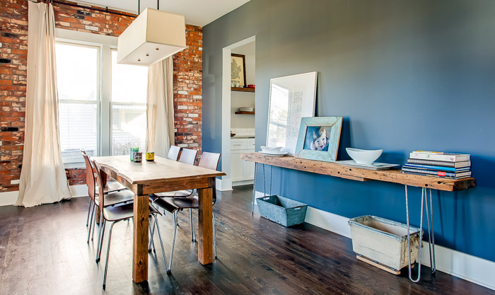
Cool colors make a room seem fresh, clean and meditative. A cool wall color can serve as a dramatic backdrop for dining, as well as a meditative space for working.
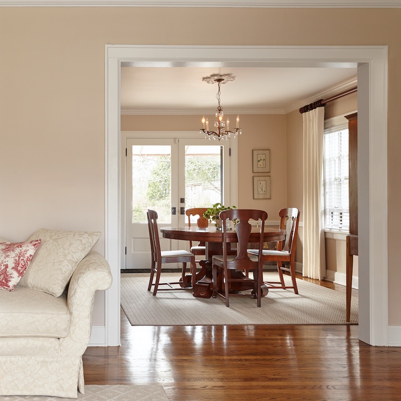
Warm colors, by contrast, are cozy and inviting. When a warm wall color is mixed with other warm elements, such as furniture and lighting, it creates a hominess.
Color Distinction…
Lightness vs Darkness
Light colors make a room seem bigger, lighter and brighter. A light wall color can serve as a soft backdrop for other dramatic elements in the room.
Dark colors, by contrast, pull the room in, add drama and emotion. When a dark wall color is mixed with other dark elements, such as furniture, it gives a richness to it.
Color Exercise…
For further clarification as to your color preferences, do the Magazine Exercise again bringing in random new images (or reviewing ones you already have) with colors that appeal to you. Ask yourself if you are seeing a theme such as…
Warm versus cool: Are the walls in the rooms overall a cool color (blues, greens, purples) or a warm color (reds, oranges, yellows)? Stark whites read cool while warm, buttery, whites read warm. So ask yourself, are the things in the room warm or cool, or is there a mix of the two? Note, woods tend to feel warm while metals tend to feel cool.
Dark versus light: Are the walls dark and the things within the room light? Or are the walls and all the things within dark and rich? Is it the other way around, with the wall and room contents light? Or are the walls light, but there are some accents and focal points that are rich and dark?
Document your color preferences and then let us move on to layering.
Love this one. I definitely lean towards cool – but also think I prefer wood over metal – with a mix of light and dark.
http://thewanderingrumpus.com
I don’t think the title of your article matches the content lol. Just kidding, mainly because I had some doubts after reading the article.
Thanks for sharing. I read many of your blog posts, cool, your blog is very good. https://www.binance.com/register?ref=IHJUI7TF
Your article helped me a lot, is there any more related content? Thanks!
Your point of view caught my eye and was very interesting. Thanks. I have a question for you. https://accounts.binance.com/en-NG/register/person?ref=YY80CKRN
Thanks for sharing. I read many of your blog posts, cool, your blog is very good.
Your point of view caught my eye and was very interesting. Thanks. I have a question for you. https://www.binance.bh/futures/ref?code=L4EUT9FG
Your point of view caught my eye and was very interesting. Thanks. I have a question for you.